Submission timeline
2007–2026One slot for every year since HN launched. Height is that year's peak points; orange marks a 100+ point or 50+ comment breakout. Select a bar to open its strongest thread.
Top comments
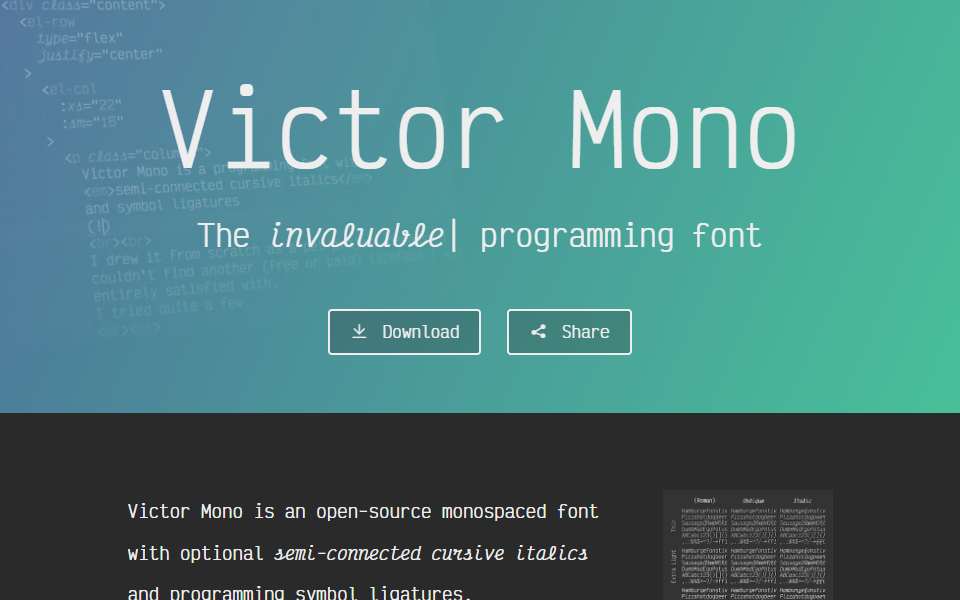
I'm generally pretty supportive of new typefaces, but this one strikes me as... not very legible. The x-height is so uncommonly high it makes it genuinely difficult to distinguish between uppercase/ascending and lowercase letters at a glance (e.g. 'U' vs 'u', or 'h' vs. 'n'), and similarly the descender is so tiny it makes it hard to distinguish certain letters at a glance (e.g. 'q' vs 'p'). The whole point of large-enough ascenders and descenders is to recognize the shapes…
Cursive unfortunately looks very distracting. Having to context-switch when reading the code between two character sets is going to be exhausting - I felt it even when looking at the example screenshots, I can imagine how taxing it would be to go through hundreds of pages of code in this mode. The non-cursive letters look pretty clean but I'm afraid cursive kills it as programmer's font for me.
The first top-level comment from each of the four biggest threads, in HN’s own order. Excerpts are shortened; open a comment for full context.
HN stats
- Breakout years
- 2
- Total points
- 391
- Total comments
- 274
100+ points or 50+ comments
reference only — not used in Hall rules or ranking
reference only — not used in Hall rules or ranking
Every submission
| Date | Title as submitted | By | Points | Comments |
|---|---|---|---|---|
| 2019-07-08 | Victor Mono | LaSombra | 2 | 0 |
| 2019-10-26 | Victor Mono – A free programming fontFirst breakout | ingve | 180 | 122 |
| 2023-07-20 | Victor Mono – Font with ligatures and semi-connected cursive italics | matricaria | 1 | 0 |
| 2023-11-19 | Victor Mono TypefaceBest thread · Latest 20+ point return | jbverschoor | 208 | 152 |