Submission timeline
2007–2026One slot for every year since HN launched. Height is that year's peak points; orange marks a 100+ point or 50+ comment breakout. Select a bar to open its strongest thread.
Top comments
For a newer font in this vein, I'd look at B612, a font designed in cooperation with Airbus specifically for visibility inside cockpits: https://github.com/polarsys/b612/blob/master/docs/B612-Leafl...
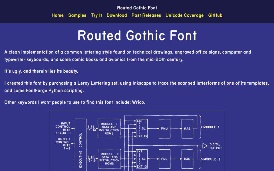
https://news.ycombinator.com/item?id=22399161 2 years ago, 57 comments Anyway, I wanted to ask: Why is it ugly? What about it is? I found it beautiful and much better looking than most fonts I see on the web nowadays.
I like those typefaces where people try to recreate/transpose/keep alive a quite physical impression into the digital realm. I always think fondly about the font Brian [1] by Jon Hicks recreating his late father’s (I think architectural) writing. [1]: https://hicks.design/shop/bryan
The first top-level comment from each of the four biggest threads, in HN’s own order. Excerpts are shortened; open a comment for full context.
HN stats
- Breakout years
- 3
- Total points
- 809
- Total comments
- 152
100+ points or 50+ comments
reference only — not used in Hall rules or ranking
reference only — not used in Hall rules or ranking
Every submission
| Date | Title as submitted | By | Points | Comments |
|---|---|---|---|---|
| 2020-02-23 | Routed Gothic FontFirst breakout · Best thread | dector | 346 | 57 |
| 2022-02-03 | Routed Gothic Font | pabs3 | 255 | 63 |
| 2024-08-31 | Routed Gothic FontLatest 20+ point return | Rendello | 208 | 32 |