Submission timeline
2007–2026One slot for every year since HN launched. Height is that year's peak points; orange marks a 100+ point or 50+ comment breakout. Select a bar to open its strongest thread.
Top comments
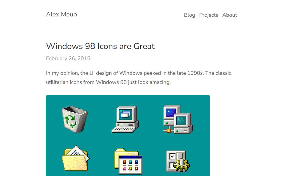
Not just the icons, the entire user interface was excellent. You had: - Clear indication of whether something was clickable or not, vs. everything flat and featureless - Good contrast - Normal-sized widgets which left enough room for content vs. the huge widgets we use today for some reason (it's weird for me to say this, but Linux desktops are the worst offenders here). I get why they're important on touch-enabled systems but that's no reason to use them anywhere…
It's genuinely hard for me to understand some of the UI/UX decisions made in the latest versions of Windows. Old versions of Windows seemed to be built in a intuitive way so even someone with no computer experience would have a chance at finding what they were looking for. Icons were designed to look like what they do. Things were labelled with text. The interface was predictable. Where as today everything just seems obscure and random... For one, we don't…
The first top-level comment from each of the four biggest threads, in HN’s own order. Excerpts are shortened; open a comment for full context.
HN stats
- Breakout years
- 2
- Total points
- 867
- Total comments
- 672
100+ points or 50+ comments
reference only — not used in Hall rules or ranking
reference only — not used in Hall rules or ranking
Every submission
| Date | Title as submitted | By | Points | Comments |
|---|---|---|---|---|
| 2019-01-20 | Windows 98 Icons are Great (2015)First breakout · Best thread | maxmouchet | 553 | 354 |
| 2023-01-15 | Windows 98 Icons are GreatLatest 20+ point return | chungy | 312 | 318 |
| 2024-04-10 | Windows 98 icons are great | RyanShook | 2 | 0 |