Submission timeline
2007–2026One slot for every year since HN launched. Height is that year's peak points; orange marks a 100+ point or 50+ comment breakout. Select a bar to open its strongest thread.
Top comments
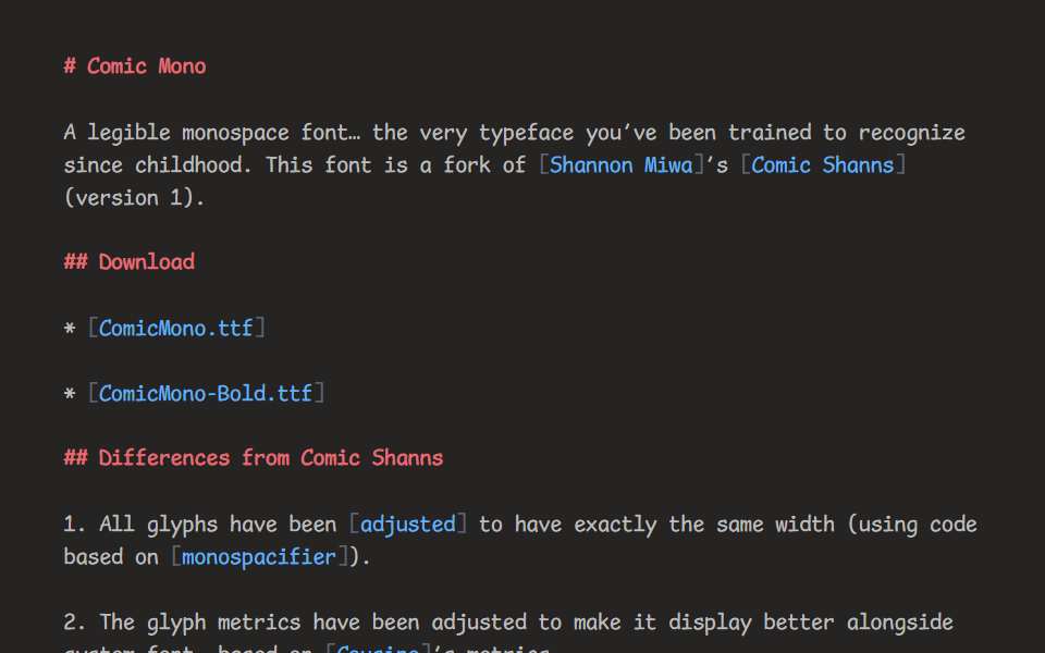
I was curious why it seems so much nicer than Comic Sans (and many commenters here seem to agree). Many of the letterforms have been dramatically "straightened" -- a Comic Sans "m" is kind of hideous, with the three vertical strokes intentionally all at different angles... whereas in this one they're all essentially vertical. Comic Sans is ugly because it's terribly proportioned (intentionally) to mimic the way a child would write. But when you straighten everything and the letters necessarily…
Comic Sans and its descendants are... indestructible. No matter how much some font designers complain about it, and how often they criticize it, Comic Sans keeps coming back, like the Terminator: https://en.wikipedia.org/wiki/Comic_Sans#Reception_and_use_i... Among the most incongruous uses of Comic Sans I've seen, a few stand out: * A plaque on a large statue of a historical figure in a public space: https://www.biobiochile.cl/noticias/nacional/region-metropol... * A letter announcing the creation of new…
I've been using a comic sans based mono font now since the last time I saw it on HN (about a year ago based on my receipt). I use a paid version called Comic Code [1] I find it very easy to read as well as fun. I had similar feelings about using Monaco in the past. I find it personally makes programming easier on the eyes and enjoyable. I remember reading the font is similar to the letters that…
The first top-level comment from each of the four biggest threads, in HN’s own order. Excerpts are shortened; open a comment for full context.
HN stats
- Breakout years
- 3
- Total points
- 1831
- Total comments
- 468
100+ points or 50+ comments
reference only — not used in Hall rules or ranking
reference only — not used in Hall rules or ranking
Every submission
| Date | Title as submitted | By | Points | Comments |
|---|---|---|---|---|
| 2020-12-23 | Comic MonoFirst breakout | thesephist | 643 | 216 |
| 2023-06-13 | Comic MonoBest thread | lolinder | 747 | 136 |
| 2024-09-18 | Comic MonoLatest 20+ point return | rootforce | 441 | 116 |